If you require to create a PDF file that contains tables and graphs, please follow the below instructions:
Illustrated in the image below is an example of a flow that utilizes static data to generate tables and graphs. The table and the graph gets created with the data by using the PDF writer step to create the PDF file and the file gets sent via the Email destination step.

- The Record Generator source step is used to add static data into a flow, The example in the below image shows the data that contains quarter values and revenue values for 2022 and 2023.

- To create graphs in Synatic, a third-party tool called QuickChart is used. This is an open source API that allows us to easily generate the desired graphs.
For more information on how to use the API, please click on the below link:
Copy the required chart’s payload from QuickChart’s URL into a record in Synatic by using the Calculator step as illustrated in the below image. This assists with mapping the values from the current payload in order to create the chart.
NB: The Replace function at the end of the record (line 15) is used to denote a template literal otherwise QuickChart will return an error.

The JSON code that was used in the above image is below:
let inputRecord = input.record;
inputRecord.graph = JSON.stringify({
    type: 'bar',
    data: {
        labels: inputRecord.data.map(rec => rec.quarter),
        datasets: [{
            label: 'Revenue 2022',
            data: inputRecord.data.map(rec => rec.revenue2022)},
        {
            label: 'Revenue 2023',
            data: inputRecord.data.map(rec => rec.revenue2023)
    }]
    }
}).replace(/\"/g, "'");
return inputRecord;
-
Add a Combine step to compile the records into one before creating the PDF file.
-
In the PDF writer step, you can click on the View Code icon (< >) to open the PDF HTML editor. Below is a breakdown of the steps involved:
A. Header String: Add a header string that will be the header in the PDF file.
B. Load Table Data: Create a table with 3 columns to display the Quarter, Revenue for 2022, and Revenue for 2023. The syntax {{#each record.data}} is used to loop through each record in the data array and populate the table with the corresponding values.
C. Generating The Chart: Use the QuickChart endpoint to generate the chart using the data from the calculator step. The chart is then saved as an image in the PDF writer step.

The example HTML code is below:
<!--HEADING -->
<h1 style="margin-left: 100px;"><strong>Revenue Data for 2022 and 2023</strong></h1>

<!--LOAD_TABLE_DATA -->
<table style="width: 96%; margin-left: calc(4%);">
	<tbody>
		<tr>
			<td style="width: 33.3333%;"><strong>Quarter</strong></td>
			<td style="width: 33.3333%;"><strong>Revenue 2022</strong></td>
			<td style="width: 33.3333%;"><strong>Revenue 2023</strong></td>
		</tr>
		<!--{{#each record.data}}-->
		<tr>
			<td style="width: 33.3333%;">{{quarter}}</td>
			<td style="width: 33.3333%;">{{revenue2022}}</td>
			<td style="width: 33.3333%;">{{revenue2023}}</td>
		</tr>
		<!--{{/each}}-->
	</tbody>
</table>

<!--GENERATE AND LOAD CHART -->
<p><img src="https://quickchart.io/chart?c={{record.graph}}" class="fr-fic fr-dii"></p>
N.B: Please note that when utilizing dynamic data to create a graph using the QuickChart endpoint, you may encounter an error (refer to the image below) in the PDF writer step. However, when you execute the flow, the graph will be generated successfully at runtime.

- In the Email destination step, add a subject, recipient and ensure that the Use Attachment checkbox is checked as illustrated in the below image.

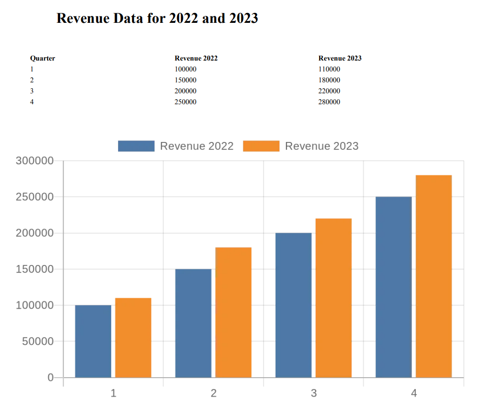
When the flow is executed, the table and graph will be automatically be generated using the data. The generated content will then be written to a PDF file and sent via email, similar to the example shown in the below image.